How to Design a Business Page on Facebook, Twitter, Instagram
 A business page on a social network is an important source of traffic and awareness rising. Brand support, advertising campaigns – everything is “tied up” to social networks. Someone copes with the task better, and someone, having thousands of subscribers, collects only a dozen likes under posts. A lot of recommendations have been written about the content and topics of the posts. Today we will focus on the page design. After all, you should “always dress to success”. So, how to design and brand profiles?
Checklist for the Design of Business Pages on Social Networks
We will move from the general to the precise. To begin with, here is a guide to the general rules for designing a branded commercial profile. How to create a business page ready for effective SMM?
1. Each profile element corresponds to a brand book. It’s better to prepare everything in advance in order not to look for a designer if necessary. The set for the design of the business page should include: logo in color and monochrome versions (or more), corporate colors, font, pattern. If you have a small company with a chief, an accountant and a cleaner, you need to at least approve the generally accepted version of the logo, choose corporate colors and fonts. Use them in work.
2. A profile picture (for Instagram, Facebook, Twitter) and profile cover (for Facebook, Twitter). The brand logo on the profile picture (simplified version, without letters and slogans) and specifics on the cover are the classic. It must visualize (maybe with the help of a text) the information about what kind of page it is, what you can find out or get on it.
3. Blanks for design options for posts. Consistent content style is the basis of branding. Logaster service generates a brand logo for free, and at the same time it provides options for covers, profile pictures, watermarks, posting templates in required sizes and a single style for each social network. The process of creating symbols is very convenient and automatic: you just need to indicate the name of the company, choose the industry and color scheme.
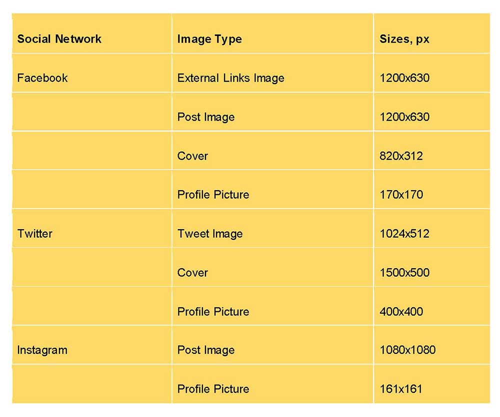
4. Image sizes correspond to the requirements of social networks. For each site you need an individual set of materials. Here is a convenient simplified cheat sheet:
 5. Availability of materials for 7-14 days in advance. We are talking about templates and ready-made posts, which include infographics, as well as images that require processing. This cannot be done “by one shoot”: so that extra fingers do not “creep out” in the photo, legs do not disappear and straight lines are not bent. There are too many risks for the brand reputation. The rest of the content is better to publish on the prepared branded templates: using a corporate font, watermark, recommended color scheme.
Instagram Business Page: Design Guidelines
The General Design of the Posts
A business page on Instagram will look good if you post in a focused manner. There are several effective options:
1. Chess – the alternation of types of posts through one, which creates the illusion of a chessboard. You can alternate black-and-white and full-color photographs, photographs and quotes on substrates, etc;

2. Vertical or Horizontal line – each row is made in a single color style, dedicated to one topic or one type of content;

3. due to the same logic, diagonal placement can be carried out.
Color spectrum

How to make a business page on Instagram recognizable? Select several primary colors and use them in the posts. The amount should be small: 1-3 basic shades. If there is a brand book, the color scheme should match it. In addition, you need to apply the same settings and filters to a single color scheme. They will make publications harmonious.
Stylistics
 Choose a few recognizable angles that you will regularly use to prepare your posts. A repeating element is needed to increase profile recognition. If the direction of the business (and the budget) allows, you can design content in a certain style: for example, draw all posts as pop art pictures.
8 Recommendations on Creating a Facebook Business Profile
Now let’s talk about how to make a business page on Facebook. What you need to start promoting branded content:
1. Unique URL. The company name spelled out after http://www.facebook.com/ is the best option.
2. Quality cover. There are three requirements: catchy bright content, harmonious combination with the profile picture, colors and style in accordance with the brand book. Place important elements and text (contact details, etc.) closer to the center: so that nothing is lost when automatically cropping photos for different types of screens.
3. A memorable profile picture. The logo is for the company, the neutral portrait is for the expert or entrepreneur. No small text and tiny details. The color scheme has to be in harmony with the cover.
4. The completed “Information” section. The business page on Facebook contains a category where the interested subscriber will look first. The text about the company should be short, but informative, attractive and not banal.
5. The “Actively reply to messages” icon. It is a winning option in terms of visual benefits. It demonstrates that the page is not dead for the audience, and that the question in the messenger will not hang for a month without an answer. To receive the badge, you need to answer 90% of calls within 15 minutes at least for a week.
6. “Call for an Action” button. It can be placed under the cover and linked to the desired page. Which button option to choose depends on the type of business and the needs of the target audience.
7. Correct meta descriptions. If you occasionally publish links (for example, articles from a blog), write up to 155 characters with brief intriguing content. Without a completed meta description, the system will “pull out” phrases from the text, and this is not a very good option.
8. More visual content in posts: infographics, images, photos, videos. Necessarily – in equal style, in compliance with the accepted color scheme, with a watermark in the form of a brand logo on a transparent background.
How to Design Business Pages on Twitter
A spectacular business page on Twitter should have a branded profile picture and cover. A logo without signatures and small details is recommended to be in the profile picture (which is quite expected). The requirements for the heading are similar to the Facebook rules: maintain sizes, a single style and color scheme in harmony with a profile picture, for customers to visually understand the purpose and scope of the company.
How to make a business page on Twitter recognizable? In addition to the profile picture and a header, you need to fill in the data on the company. The best description is concise, filled with useful information: about the purpose of the profile, brand mission, etc.
The visual content for Twitter must comply with the approved scheme. This applies to colors, content, style, presentation. You can come up with a corporate hashtag to mention in every post. In a tweet, in addition to text, the content of a picture or GIF-image, a link to a site, a survey, geolocation are allowed.
5 Principles of Modern Design of Business Profiles on Social Networks
1. Start by Setting a Goal
To answer the question of how to make a business page, you need to understand why it is needed. To be “like everyone else”? No. Goals should be specific, measurable, achievable, with fixed time frames. Page performance indicators need to be tracked and analyzed at least once a week.
2. No Contradictions
Pages need to be perfect in terms of visual and semantic content. The profile picture should be in harmony with the profile header, as well as with the images in the peed. Do not copy posts from other social networks. Different dimensional standards may distort images.
3. Content for the Audience
The analysis of the target audience comes first, and only then – branding the profile, preparing a content plan. Who is your audience? In which location and market niches is it located? What makes people interested? What is unique about your page? The list of questions can and should be continued: the more detailed answers, the more opportunities to evaluate your target audience and choose the only right option for the design.
4. Everything Is According to Plan
Do not wait for the inspiration: you should have a strategic content plan for 6 months, a detailed monthly and maximally detailed weekly. The plan should have a place for company news, information about the product and its advantages, useful data, surveys and contests, as well as other interactions with the audience.
5. Quality and Only Quality
Every minute 1-2 hundred thousand new publications appear in the top social networks. The audience has something to choose. It’s moody: if the content doesn’t attract people and does not provoke them, she will simply ignore the posts.
Conclusion
How to design a page for business? Approach the implementation of the idea in the same way as you approach the organization of advertising campaigns or brand development. Planning, preparation of visual solutions, professional creation of posts, and customer focus are the components of a successful business account promotion strategy.


